Before & After | Kitchen
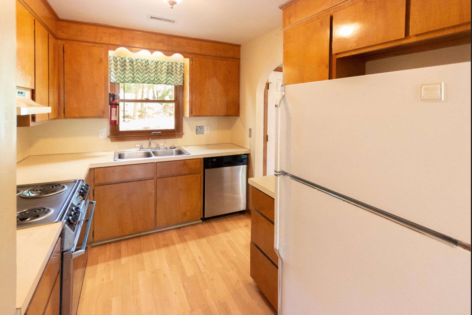
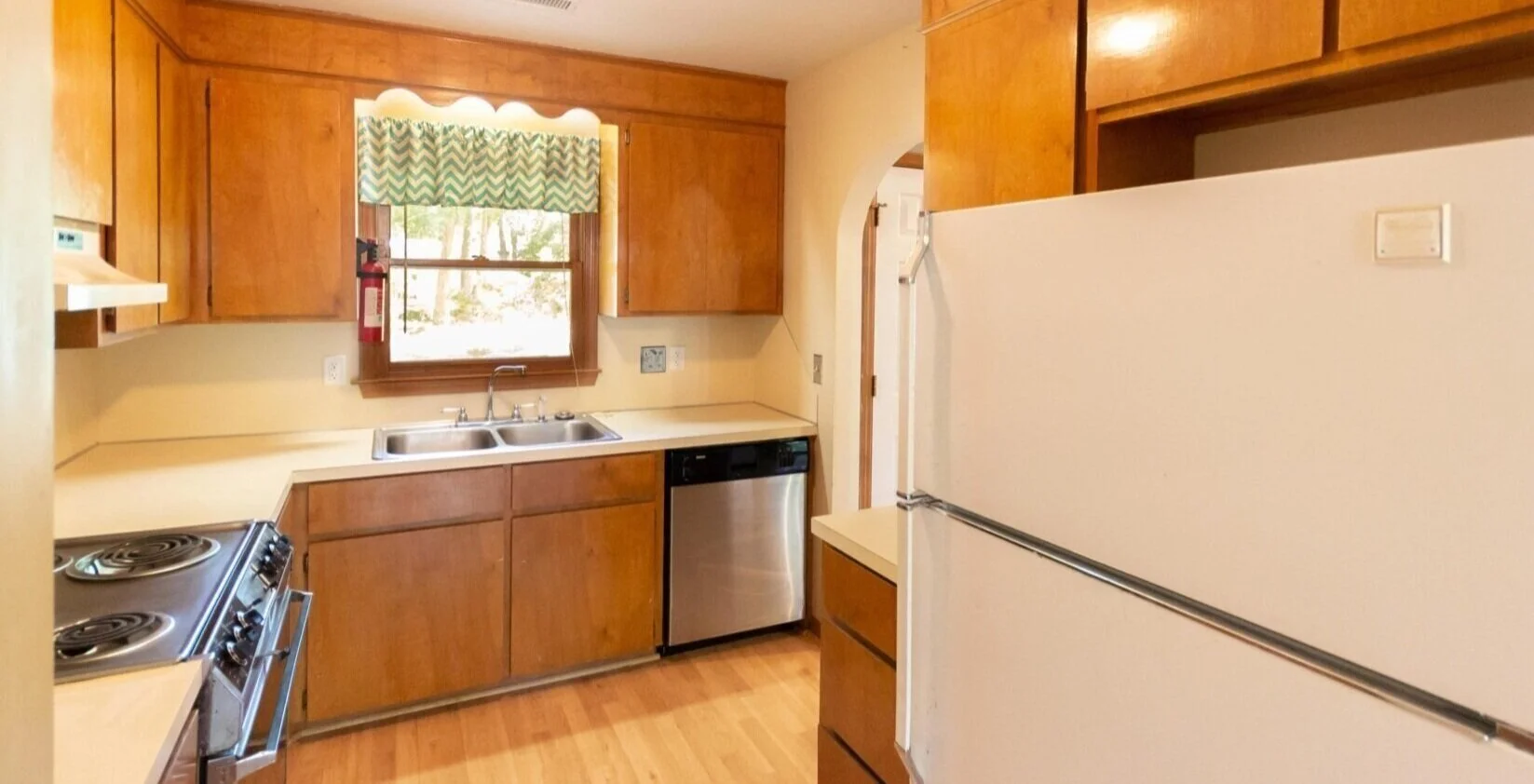
In case you haven’t noticed yet: kitchens built in 1986 were very brown. I think that’s the theme of the “before” of this house. Brown trim, brown cabinets. . . whew. One of the first things I was eager to do to this place was paint those horrible shiny brown cabinets!
OK yeah and that stove was so old, the time changed when each number rotated through to the next. We promptly replaced all the appliances.
My dad cut the cabinets above the stove in half and installed the microwave above it for us. The counter space is already wayyy too limited to have a microwave take up space on it.
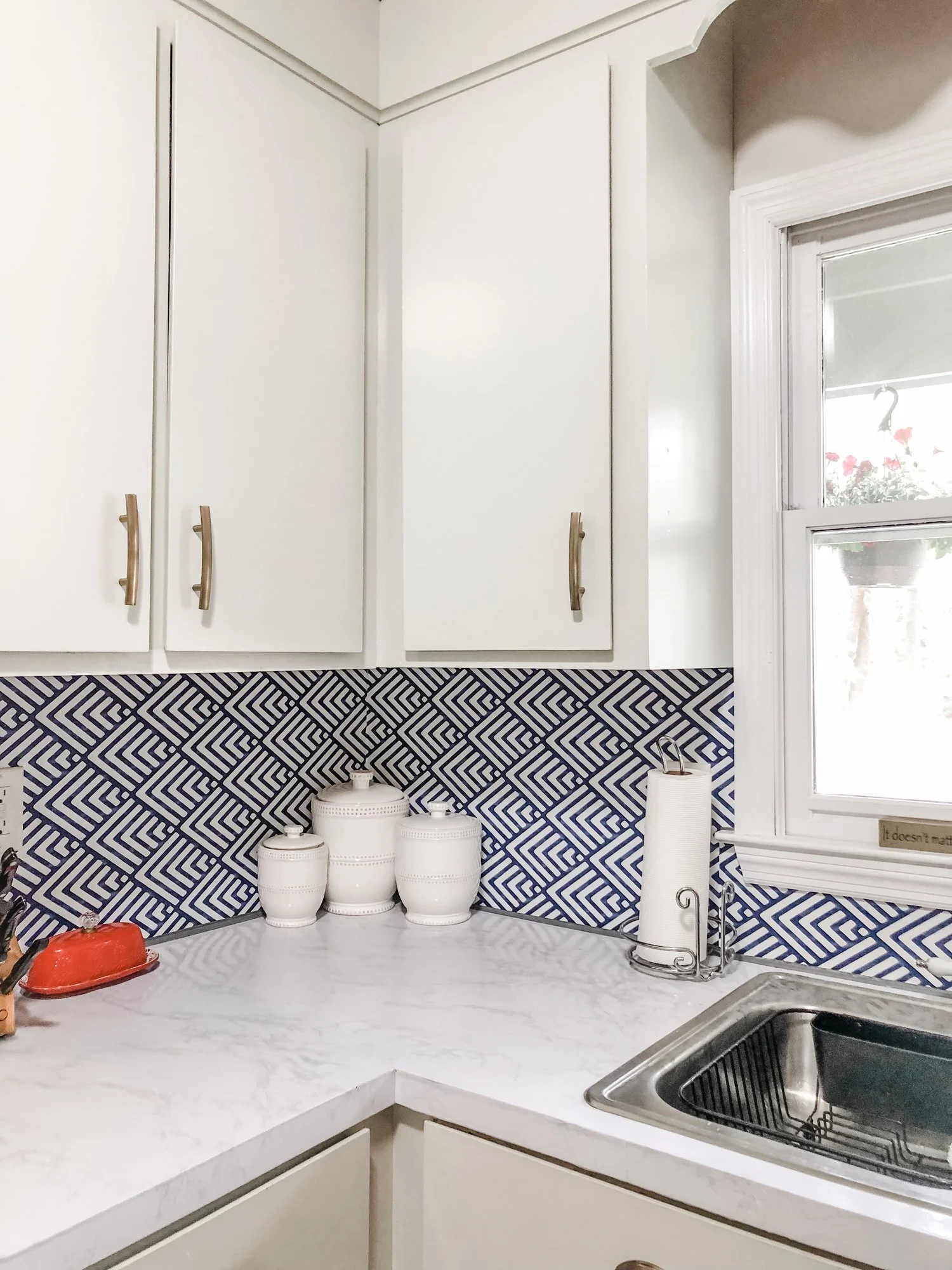
Then I tackled painting the cabinets. I actually have a full blog post on this project, so I won’t go into it too much here. We painted the cabinets and added hardware, since there was none.
Then I did a little somethin’ with the countertops and backsplash. You can read my blog post about those here. I spent less than $500 on the whole kitchen project!
I was really hoping we’d be able to tackle a full kitchen renovation after a year or so, so I went a little out of my comfort zone with the colors and design choices. Plus, I did it pretty much as inexpensively as possible. I’m definitely happy with how it turned out for a short term solution but we’ve been here a year and a half and I’m ready to demo the whole thing :)
. . . maybe after the baby comes? This might be wishful thinking too.
Regardless, I will take this kitchen over that brown kitchen any day!
photo by dreampop media
I have big (expensive) dreams for this kitchen. . . one day.
Directly behind what you see in the above photo is the fridge and a couple cabinets, which back up to the living room. I want to knock out the top part of that wall and make that spot an island instead. This would make the space way better for entertaining. I picture moving the stove to the island, with a microwave in the island, and move the fridge to the side where the stove currently is.
I love entertaining and the functionality of the kitchen now is not conducive. What’s that term for small kitchens? A “one butt kitchen?” That’s what we’ve got now.
Here’s some inspiration photos of what I love.
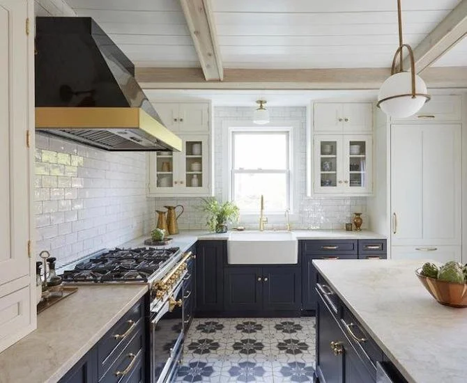
kitchen by Beki Owens
This is similar to the layout I’d like, except move the stove to the island and fridge to where the stove is pictured here (approximately). Our sink/window would be in that same spot. I love the blue on the bottom and white on the top, and subway tile, the lighting and the sink!
kitchen/photo via Westridge Homes
Again I love the blue and white, and the pendants. Blue is my favorite color, can you tell? This space is similar to the size we would be working with, so it’s interesting to see what people do with smaller spaces. (We would need a pantry space somewhere, though!)
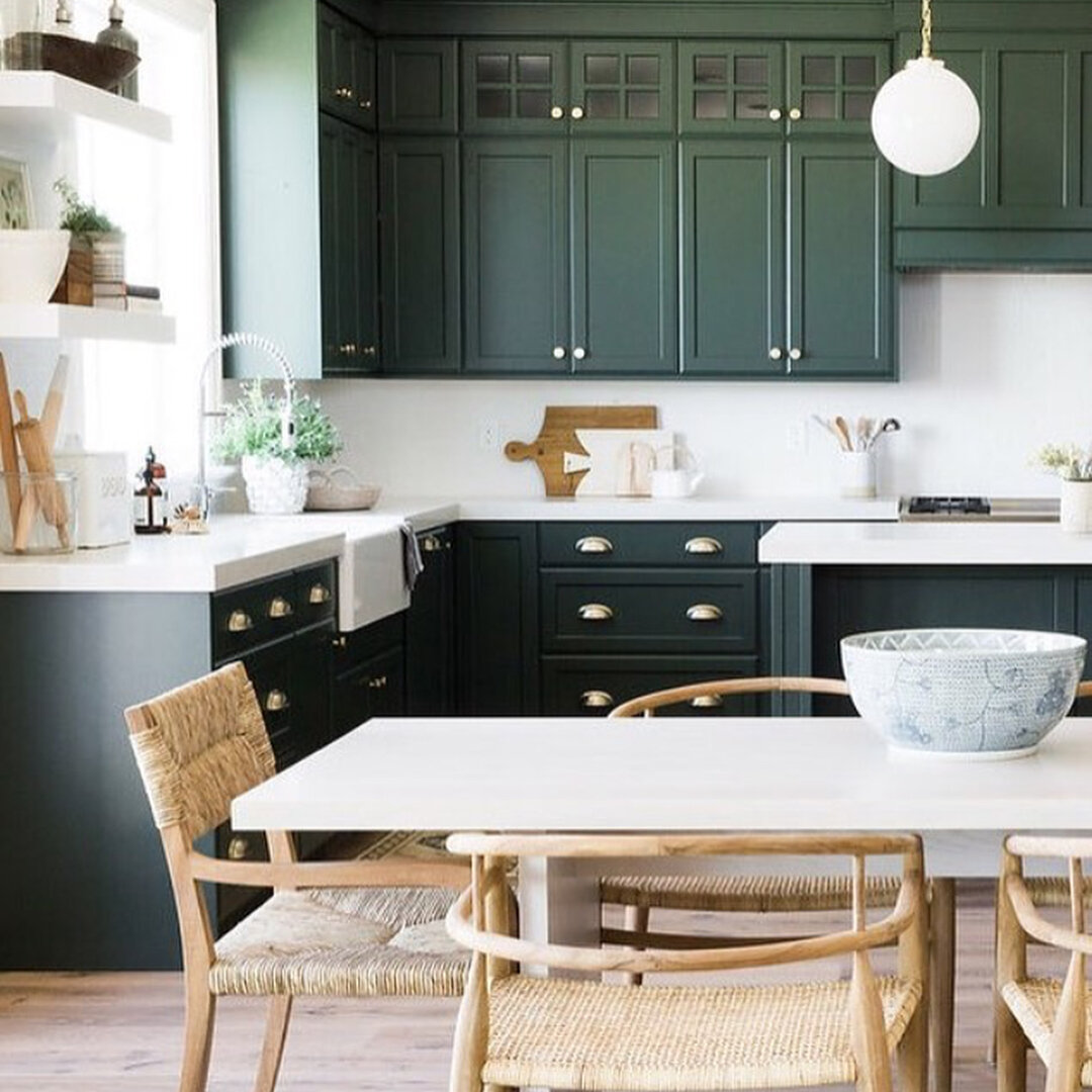
Image via tsbuilder/Instagram
But ummmm this green is fun!!! Clean, simple backsplash. The countertops don’t even look like granite, quartz or marble, but I like them a lot. And again, a big farmhouse sink. I like the steel ones, too.
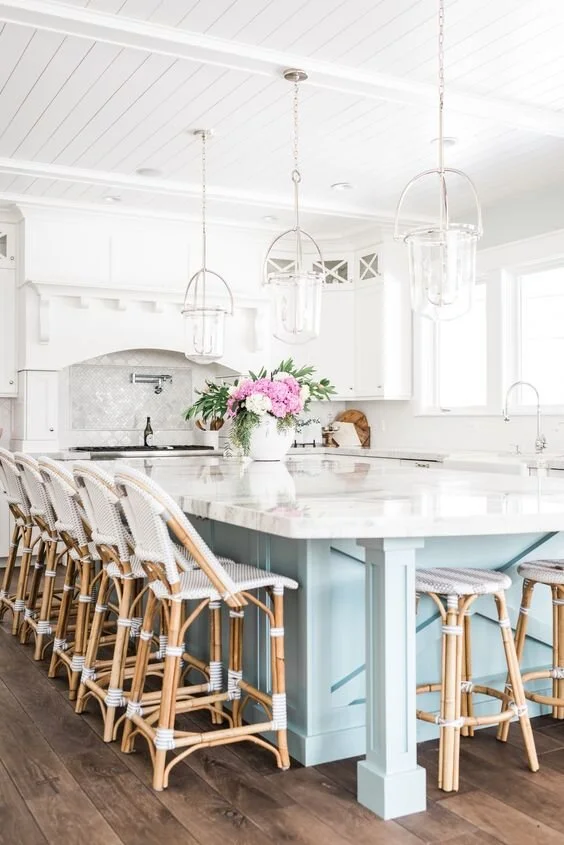
photo via rachelparcell.com
This one is also lovely! I’ve always loved white and bright. The light blue in the island gives just enough zest. I picture having flowers in a vase there in the middle of the island just like that! The stove here is fab but ours won’t ever be like that. Aren’t the shiplap ceilings fun?!
Help me manifest a new kitchen ASAP, will you? :)
